JLC - Logo Development
The Story Behind the JLC Logo: A Creative Journey
Crafting the JLC logo was more than a design project; it was a journey of self-discovery and artistic refinement. From the first sketch to the final design, each iteration reflected my evolving identity as an artist and my desire to create a mark that speaks to who I am. This logo became a symbol of intention, precision, and growth—a mirror of my creative ethos.
The Spark of Inspiration
The foundation of the JLC logo rests on three simple letters: “J,” “L,” and “C.” These initials hold deep personal meaning, embodying my name and artistic vision. From the beginning, I wanted a logo that exuded elegance, modernity, and timelessness while remaining uniquely mine. Serif typefaces, with their balance of tradition and strength, immediately resonated with me as the visual language I wanted to explore.
The Creative Process
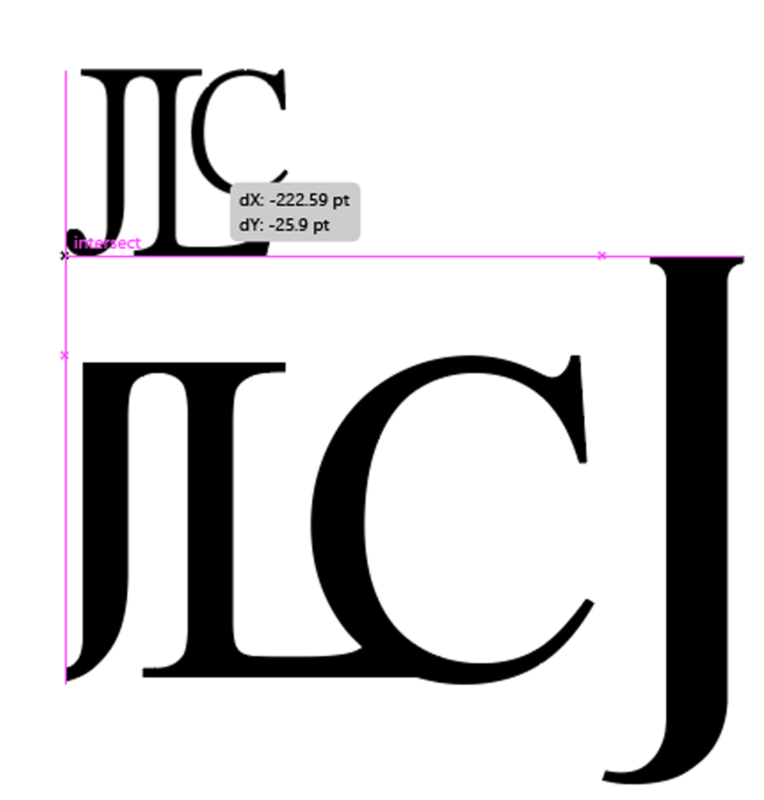
The initial phase was marked by exploration. I experimented with countless typefaces, playing with proportions, angles, and spacing. Some designs felt too rigid; others lacked cohesion. The process became a delicate dance of finding harmony between the letters. I scrutinized every curve and line, searching for ways to unify the “C” with the vertical presence of the “J” and “L.” Negative space, often overlooked, became a crucial element, adding balance and clarity to the design.
This phase was more than a technical exercise—it was a deeply introspective journey. I continually asked myself: What story should this logo tell? What emotions should it evoke? Each answer shaped the design, leading me closer to a mark that felt authentic.
Refinement and Precision
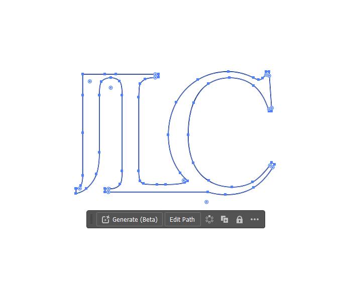
A pivotal moment came when I realized the significance of alignment—both visually and conceptually. Aligning the “J,” “L,” and “C” required painstaking adjustments to create balance and harmony. The smallest changes—adjusting the curve of the “C” or elongating the serif of the “J”—made profound differences. These refinements demanded patience, but they brought the design to life.
The letters needed to feel interconnected yet distinct, much like the various facets of my artistic practice. I examined countless variations, ensuring every detail—from pixel spacing to line weight—felt intentional. Precision became my guiding principle, and each adjustment brought the logo closer to its final form.
The Palette of Sophistication
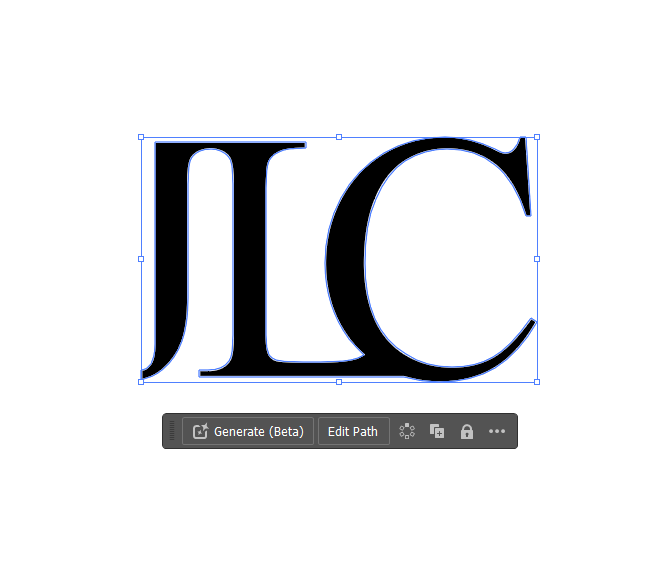
Once the form was perfected, I turned my attention to color. I wanted a palette that conveyed timelessness and sophistication. After testing multiple combinations, I chose a deep midnight blue as the background. This rich hue offered a sense of grounding and elegance, while the crisp white lettering provided contrast and clarity. This restrained color scheme allowed the design to shine without distraction.
The Final Design
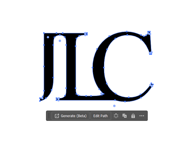
Seeing the completed JLC logo was a moment of profound fulfillment. It felt like a culmination of my creative journey—an emblem of my identity and aspirations. This logo is not just a visual mark; it is a testament to the countless hours of thought, experimentation, and refinement that went into its creation.

Reflections and Takeaways
The journey of creating the JLC logo taught me invaluable lessons about design and artistry. It reaffirmed the importance of iteration, the power of subtle details, and the beauty of simplicity. Each curve, angle, and decision holds meaning, and the process of refining these elements is where the magic lies.
Today, the JLC logo stands as both a personal and professional symbol. It represents my growth, my vision, and the future I am building as an artist. While its creation marked the end of one chapter, it also serves as a reminder to keep pushing boundaries and embracing new creative challenges.