KC93 - Logo Dev
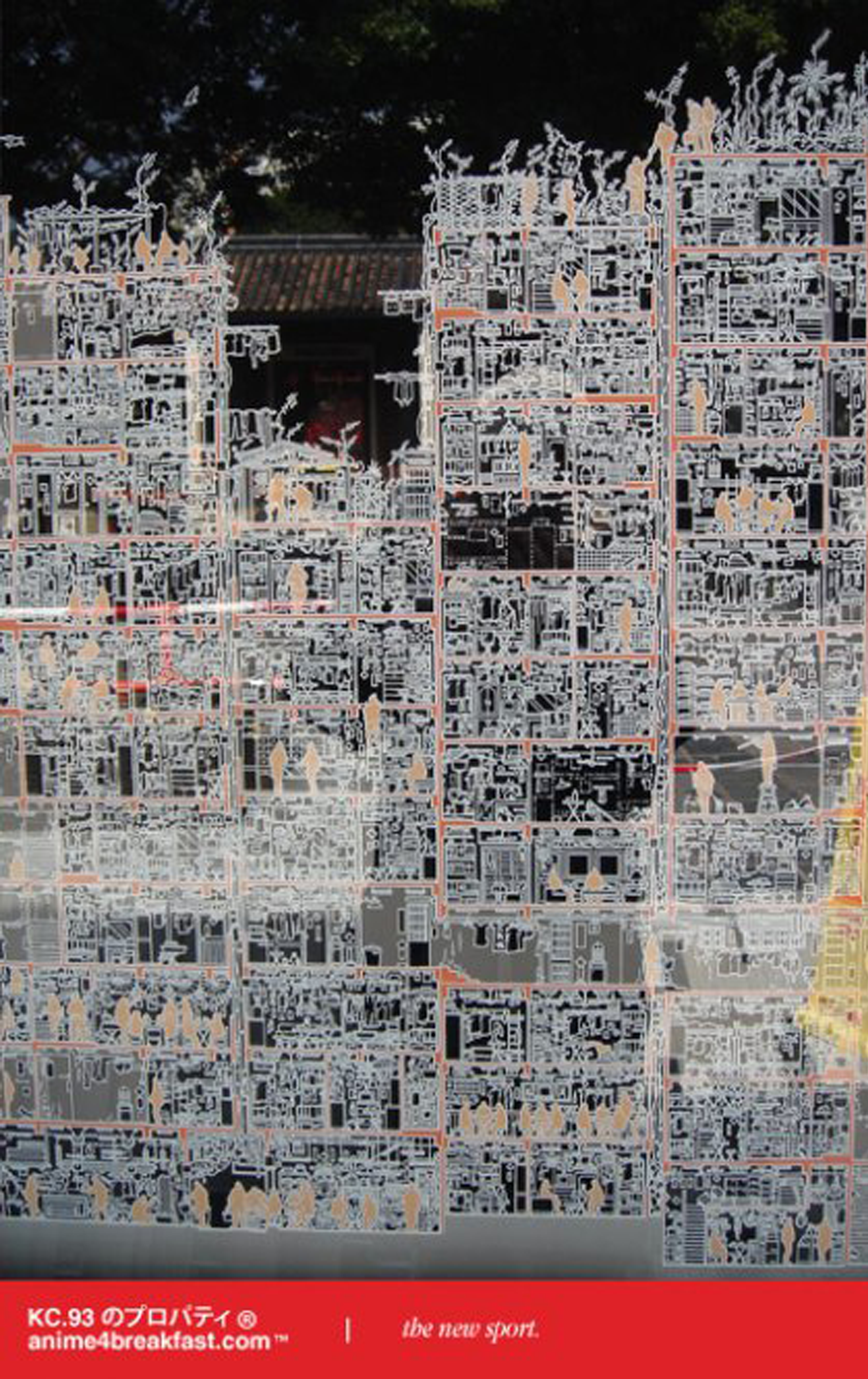
 A4B! Issue 01 advertivements - 2007 / Feb.
Logos have always fascinated me. There’s an art to distilling an idea, a vision, or even a philosophy into a single symbol that communicates volumes. While working on this project, I realized how much I enjoy not only developing logos for others but also designing my own. It’s a deeply personal and artistic process, a combination of strategy and creative instinct.
 A4B! Issue 01 advertivements - 2007 / Feb.
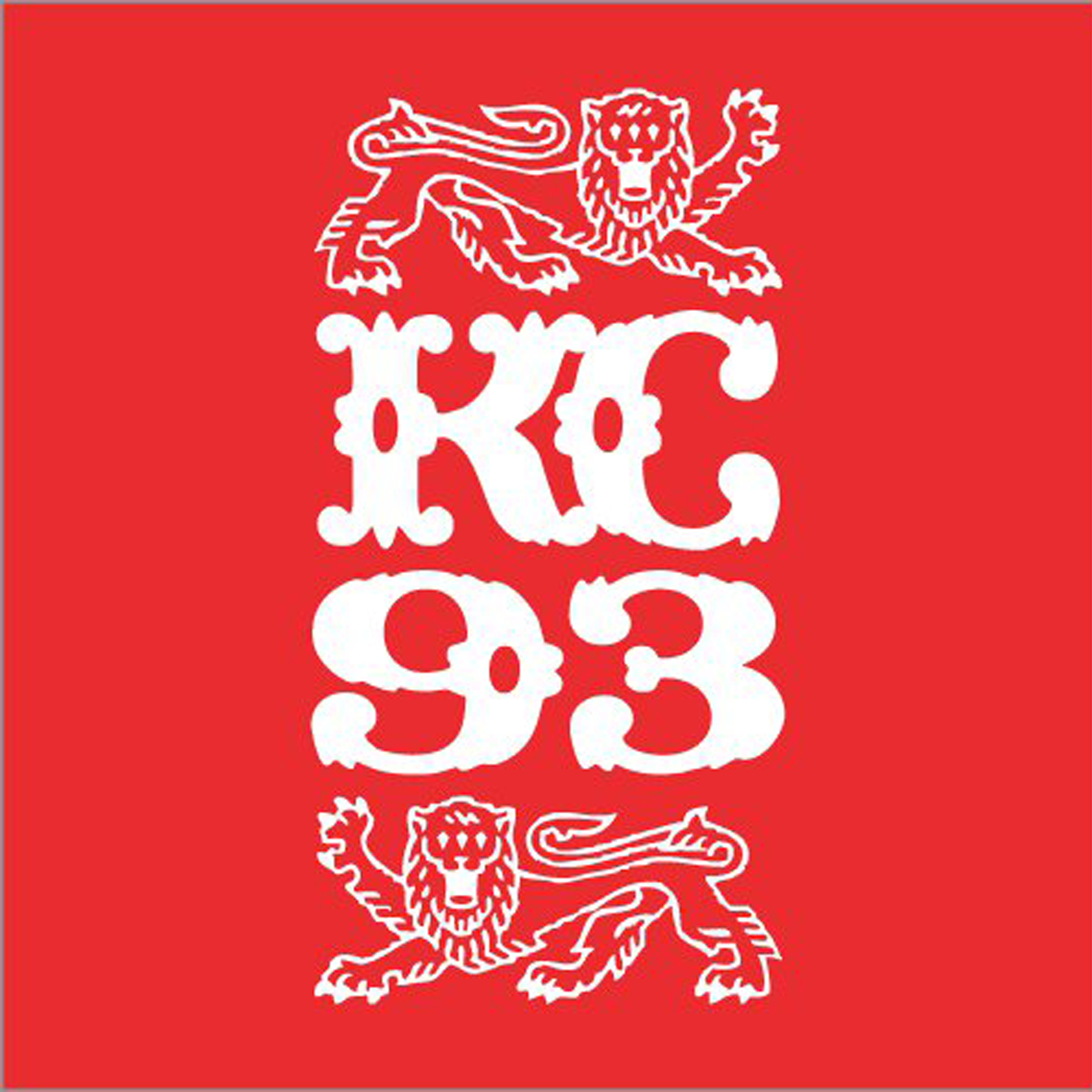
The lion aesthetic spoke to me for its inherent symbolism: strength, leadership, and courage. But I wanted to go beyond the traditional representation. Through numerous iterations, I introduced a mystical edge by adding a third eye to the lion—a detail that brings layers of meaning. To me, the three-eyed lion represents wisdom, foresight, and a regal sense of power that transcends the ordinary.

The color palette was another deliberate choice. I settled on red and white, inspired by the bold and striking hues of China’s national flag. The red symbolizes vitality and passion, while the white balances it with purity and sophistication. Together, they create a harmonious visual statement, blending cultural significance with modern elegance.

Seeing this design evolve into a masterpiece has been incredibly rewarding. It’s a reminder of how much thought and intention go into the details that often go unnoticed. This logo is more than a symbol; it’s a narrative—a representation of mysticism, royalty, and cross-cultural inspiration.
As an art director, this project reaffirmed my love for crafting visuals that tell stories. Logos are not just design elements; they are identities, and the process of creating them is nothing short of an art form.