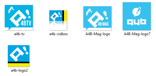
A4B! - logo Dev Beta

A4B! logo (Draft Development) for 2006 - 2007
The creation of the A4B logo was born from a nostalgic spark of imagination that lingered in the corners of my mind. When designing this logo, I aimed to capture the joy and excitement I felt as a child while drawing—a pure, unfiltered sense of fun. I wanted the design to reflect that same spirit while incorporating the “A!” as a nod to the anime inspiration behind the name.

A4B! logo - Draft Development / 2006 - 2007
The creation of the A4B logo was born from a nostalgic spark of imagination that lingered in the corners of my mind. When designing this logo, I aimed to capture the joy and excitement I felt as a child while drawing—a pure, unfiltered sense of fun. I wanted the design to reflect that same spirit while incorporating the “A!” as a nod to the anime inspiration behind the name.
The idea for Anime4Breakfast came during countless late-night sessions watching Adult Swim, waiting patiently for the anime block at 11:30 P.M. It struck me how late the wait felt—so much so that they might as well call it “Anime for Breakfast.” And that’s when it all came together: “I’ll create an anime world of my own!” From that epiphany, Anime4Breakfast was born—a platform where art, creativity, and nostalgia converge into something extraordinary.
The Color Palette of the A4B! logo
The color palette of the A4B logo plays a central role in its identity, beginning with the aqua blue backdrop. This shade was inspired by the concept of an “Anime Island,” a place of escape and creativity that reflects the boundless imagination tied to anime culture. Aqua blue became the foundation, symbolizing a calm yet adventurous sea of ideas, inviting viewers into a world of nostalgia and fun.
When developing the logo, I envisioned a flag—a bold emblem representing a community of anime lovers and dreamers. This led me to incorporate a mix of visual elements that capture the essence of this concept. The typeface draws from retro 8-bit pixel art, paying homage to classic gaming culture and giving the logo a playful, timeless vibe. The exclamation mark, pulled from comic book-style fonts, adds energy and excitement, as if announcing, “This is where the adventure begins!”
Each element—the color, the font, and the composition—came together organically to create a logo that is both playful and iconic, embodying the essence of Anime4Breakfast as a hub of creativity, nostalgia, and endless possibilities.